Opulent Three-Tone Color Schemes to Emulate at Home, Creating an Appearance of Grandest Luxury Ever
=================================================================
Tash Bradley, an expert in color psychology and theory, has made a name for herself by providing color consultations on over 6,000 projects across the UK, EU, and US. Her latest creation, a series of rich and vibrant color combinations, is set to make a bold impact on homes around the world.
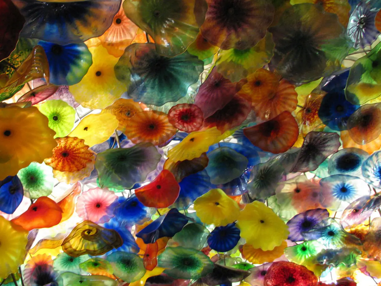
One of Bradley's favourite combinations is the triad of teal, purple, and taupe. This scheme, when coordinated throughout a home, creates a cohesive and visually striking look. To achieve this, Bradley suggests using a color scheme framework such as triadic or complementary schemes, which offer vibrant contrast with harmony.
The 60-30-10 rule is another key principle in Bradley's approach. This rule dictates that approximately 60% of the space should be allocated to a dominant color (often a neutral or muted tone like taupe or deep brown), 30% to a secondary color (such as rich teal or burgundy), and 10% as a bold accent (coral or golden yellows). This creates balance and rhythm across rooms.
To unify the palette, Bradley recommends keeping colors within the same undertone family (warm or cool). She also suggests using consistent trim or ceiling colors between rooms to create smooth transitions, even when wall colors differ.
Anchoring rooms with key elements and varying textures is another important aspect of Bradley's design philosophy. Use large furniture or art pieces as "color anchors" that embody main colors (e.g., a teal sofa or burgundy artwork), then bring in other hues via textiles like curtains, rugs, pillows or décor. Mixing textures adds depth and avoids a flat look.
Bradley also emphasizes the importance of combining deep colors like dark green or burgundy with neutrals such as taupe or cream to ground the palette. Incorporating sumptuous materials (velvet, leather) enhances the richness and visual interest.
Another favourite combination of Bradley's is burgundy with coral and golden yellows. This scheme is best used in rooms where boldness matters and the design needs to carry visual weight, such as in kitchens, libraries, or formal dining rooms.
Oksana Zavarzina, founder of design studio Lake and Walls, recommends pairing emerald green with a deep brown of a similar tone for a classic take on a rich color combination. Zavarzina's studio creates interiors, architecture, and furniture for creatively minded clients.
Red and yellow together can be a chic combination with the right tonal mix. The color combination of dark teal, plum purple, and taupe is curated for a romantic and considered atmosphere.
Bringing in burgundy velvet or mohair on the chairs or accents, and letting ivory come in through soft textures like plaster ceilings, linen panels, or vintage lampshades is recommended for a dramatic look.
For those seeking inspiration, Bradley has authored a book called "Master the Art of Colour". Her work demonstrates that with careful planning and a keen eye for balance, rich color combinations can transform a home into a stunning, dynamic, and harmonious space.
[1] Color Theory for Interior Design: The Complete Guide [2] The New Book of Interiors: The Complete Guide to Decorating Your Home [3] The Complete Book of Home Decorating: A Room-by-Room Guide to Decorating Your Home [4] Interior Design Masterclass: A Guide to Creating Beautiful Spaces [5] The Design Edit: The Ultimate Guide to Interior Design
- In rooms where boldness matters, Tash Bradley suggests using a bold color scheme like burgundy with coral and golden yellows, ideal for spaces such as kitchens, libraries, or formal dining rooms.
- When coordinating a cohesive look throughout a home using a triadic or complementary color scheme, Tash Bradley's favorite combination includes the triad of teal, purple, and taupe.
- To ground a rich color palette, Tash Bradley recommends pairing deep colors like dark green or burgundy with neutrals such as taupe or cream and incorporating sumptuous materials like velvet and leather.
- Oksana Zavarzina, founder of Lake and Walls design studio, pairs emerald green with a deep brown of similar tone for a classic take on a rich color combination.
- For a romantic and considered atmosphere, the color combination of dark teal, plum purple, and taupe could be curated, as recommended by Tash Bradley's book "Master the Art of Colour".
- To achieve balance and harmony in interiors, Tash Bradley advocates for the 60-30-10 rule, which divides space into dominant (60%), secondary (30%), and accent (10%) colors, often using neutral or muted tones.


